(+44) 7967 889281
BHF Donate


The British Heart Foundation (BHF) is a well-known charity organisation in the United Kingdom dedicated to fighting heart and circulatory diseases. he British Heart Foundation (BHF) website plays a crucial role in providing valuable support, information, and resources to individuals with heart conditions, their families, and medical researchers. It also plays a significant role in raising funding to support their life-saving research and initiatives by supporting and hosting Online Donations, Fundraising Events, Campaigns and Appeals, Gift Shops and Merchandise, Partnerships & Corporate Support and Legacy Giving
THE PROBLEM
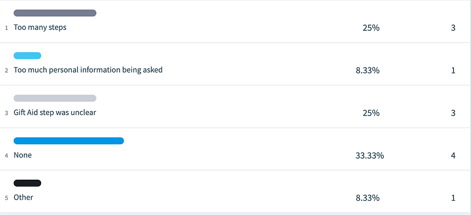
The existing money donation journey contains too many steps which results in user frustration or abandonment early on in the process.
Item donation causes frustration for both customers, customer services and store staff due to the fact that particular items don't meet the criteria for re-sale.
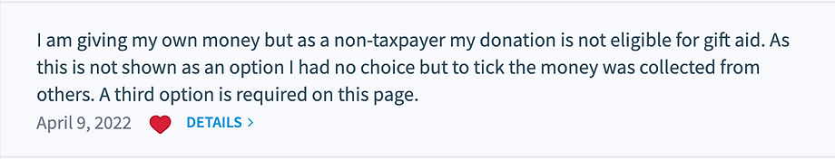
When donating Money or Items, there is a high volume of users not opting in for Gift Aid due to a lack of knowledge or awareness.
RESEARCH
Competitor Analysis
I carried out competitor analysis to gain insights and learn from industry best practices, identify opportunities for improvement, and differentiate our existing designs to provide a superior user experience. We looked at Eight other charities to see what they were doing well. Here are three example from my research.
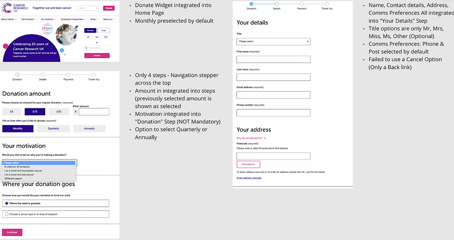
Cancer Research
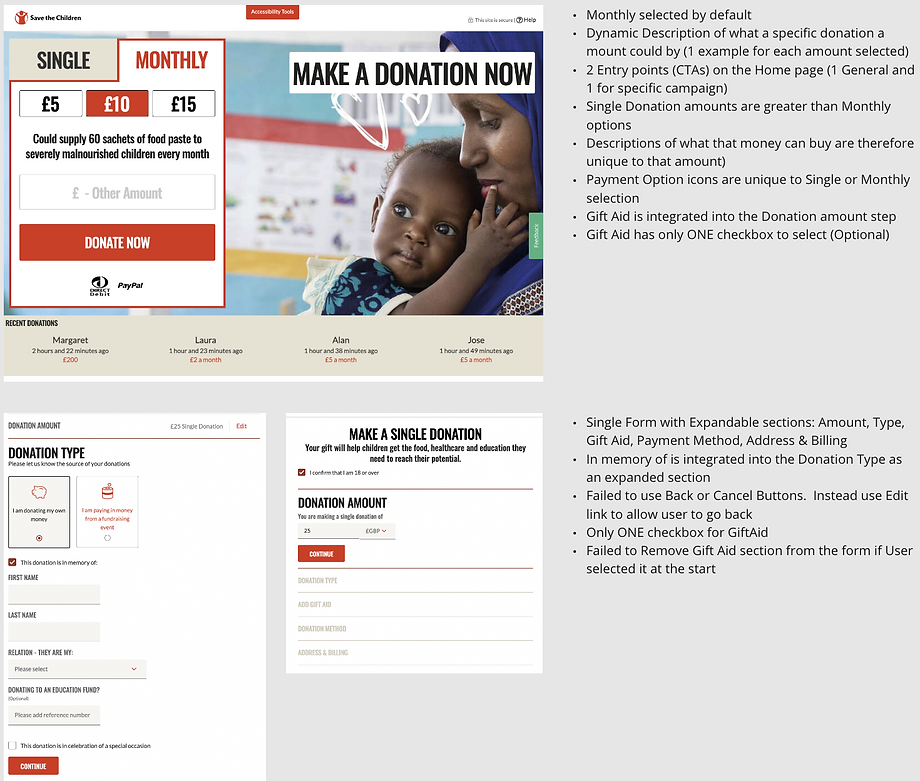
Save the Children
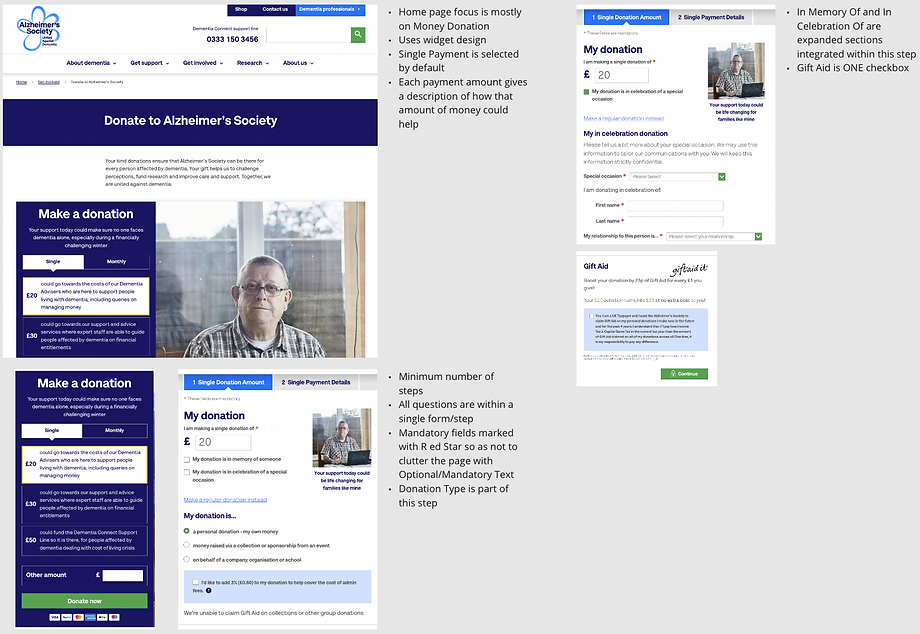
Alzheimers's Society
Online Survey
Content to be added

Google Analytics from CRO Team
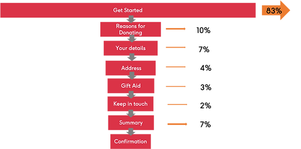
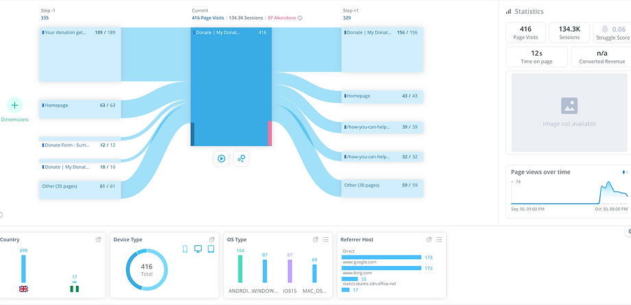
Donate Form Funnel
The highest drop off rate is from the first step in the journey the 'Get started page' at 83%. 'Reasons for Donating' The funnel diagram shows the next largest abandonment rates indicating pain points throughout the journey
Key Learnings:
The total abandonment of the first step of the form has been 83%. The majority are going on to view:
• furniture collection
• in-memory
On the Direct Debit Journey there is a large drop of on the 'Direct Debit' page at 15%
Mobile visitors are less likely to progress to the confirmation page, with a conversion rate of 10%
Mobile users are less likely to complete the first step with 86% drop off on step 1 compared to 77% on desktop
User Behaviour Analysis using Session Playback
Monitoring user behaviour using the Analysis tool Glassbox provided the following insights across 311 users:
Main issue is the 'widget' page
When people start the form, they tend to continue. There is little drop off
Approx 50% of users go to different pages - mainly the homepage and 'how you can help donate' and in view other ways to donate'
54% of users access via mobile
21% of users abandoned the form at the Get Started Page
47% of users continue onto the next step after selecting the Donate amount
13% go to the homepage
12% go to the 'donate' landing page
10% go to 'view other ways to donate' page
ANALYSIS
Affinity Mapping
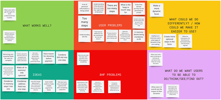
With all the information gathered from Surveys, Qualitative Interviews, Usability Tests & Benchmark Testing it was time to analyse the data and work out what was relevant to improving the most common user journeys acros the BHF site. In order to gain a high quality output and faster analysis, I arranged and managed an Affinity Diagram session with the entire Digital team allowing me to group areas of high importance that would later make up parts of the Users Journey when Donating Money and Items. The Digital team were involved with grouping the post it notes into relevant groups, encouraging discussions between Content, CRO, Designers and the Product Owners, allowing the whole team to gain a shared understanding of what we were trying to achieve.
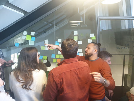


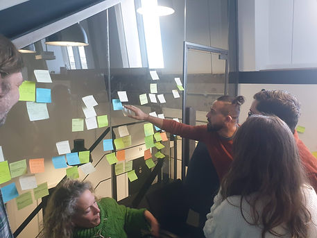
During the session all post it notes containing research information from the various sources were placed into groups and following further discussions were moved around accordingly. Following the session these groups were named and numbered according to which step in the purchase process they fell into.
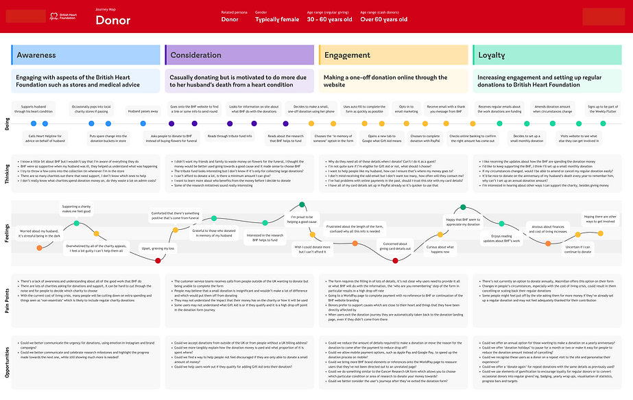
Customer Journey Map
Further analysis of the groups created from the Affinity Diagram allowed me to delve deeper into the key steps of the User Journey. For each step in that journey I examined what were the users goals and behaviours, in what context were they carrying out these steps, what were their pain points along the way and how did they feel throughout the journey. I created a Customer Journey Map as a more structured, simple & effective way to present the Customers point of view to the Product Owner and Business Stakeholders. The map provided an overview of key areas within the site that needed improvement in terms of User Experience.

Research Conclusions
Following numerous discussions with the Product Owner, Stakeholders and Development teams, there was a general consensus that the following requirements would enhance the User Experience of the BHF website
-
During the Donate Journey, the lengthy and complicated process deters users from completing their donations, especially when they encounter unnecessary or redundant steps along the way.
-
The Donate money journey has the largest drop off at the who are you remembering and the gift aid stages showing these are perhaps confusing to the user.
-
•18% of users in the donate items journey leave on the collection form to read about items BHF can’t sell. This is showing a disconnect between the purpose of donating items and users perspective.
-
The key issues with furniture collections seem to stem from a lack of understanding that BHF sell the items instead of donating them on
-
Items being donated very often fail to meet validation requirements and can therefore not be sold on
-
People not understanding how Gift Aid works especially when donating Item
Proposed Solutions
Home Page: Needs to have a TWO clear and prominent call-to-actions (CTAs) that encourages users to donate. One for Donating Money and One for Donating Items. The CTAs should stand out visually and use compelling copy to motivate users to take action.
Donation Information: After clicking on the CTA, the user should be directed to a page that provides detailed information about the donation process. This page should explain the purpose of the donation, how the funds will be used, and any impact stories or testimonials that demonstrate the charity's work. Including visuals, such as images or videos, can help create an emotional connection and inspire trust.
Donation Options: On the donation page, the user should be presented with various donation options to cater to different preferences and budgets. These options can include predefined amounts, suggested amounts based on the charity's projects, or a custom donation field where users can enter their desired amount. Providing multiple payment methods (e.g., credit card, PayPal, etc.) can also enhance convenience and accessibility.
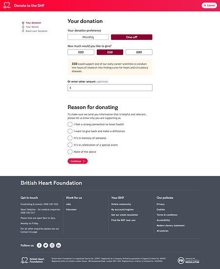
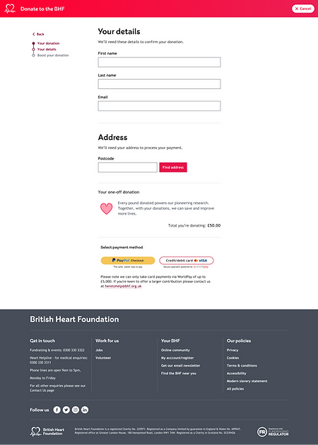
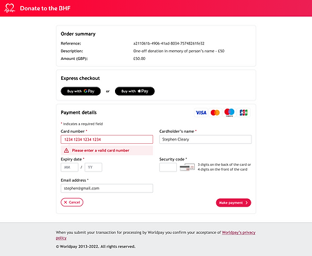
Donation Form: When the user selects a donation amount, they should be guided to a secure and user-friendly donation form. The form should be concise and intuitive, requesting only essential information such as name, email address, and payment details. It's crucial to ensure that the form design is visually appealing, easy to navigate, and reassures users about the security of their personal information.
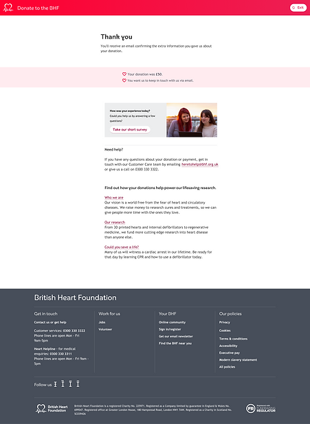
Confirmation and Thank You: After completing the donation, the user should be presented with a confirmation screen that acknowledges their contribution. It's essential to express gratitude and show appreciation for their generosity. Additionally, the confirmation page should provide an option for the user to receive a donation receipt for their records via email or download.
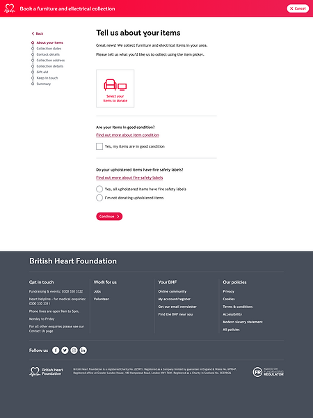
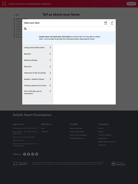
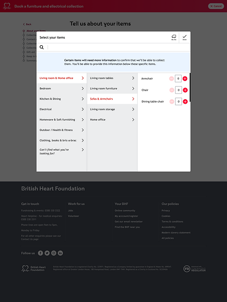
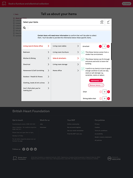
Item Donation: Add validation functionality to the collection form during the Item Picker steps allowing users to input further details of items they are donating such as inclusive fire label tags and the items condition.
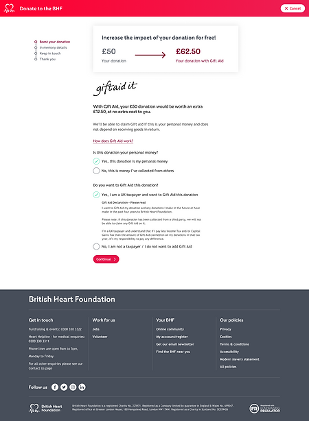
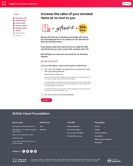
Gift Aid - Ensure there is a clear explanation of how gift aid works and how it can benefit the BHF at no extra cost to the Customer.
SOLUTION DESIGN
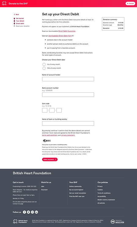
Wireframes - New Donate Journey
Using Figma I created High Fidelity Wireframes that reduced the number of steps taken for users to donate money. This was achieved by combining steps within the journey and providing users with more context and feedback on each page
Wireframes - Collections Journey Item Validation
Using Figma I created High Fidelity Wireframes that allowed users to validate the items they planned to donate before arranging a collection from a BHF driver. This ensured the user could check the items met certain quality and safety criteria that is required for re-sale within the BHF stores


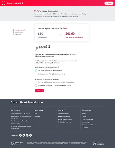
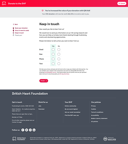
Wireframes - Gift Aid
In order for users to gain a better understanding of how gift aid works, the following pages were designed to be presented to users either donate money or donating item journeys. The pages clearly explain how Gift Aid works and give users the message that its claimed at no extra cost to them. It also incorporates the declarations onto the page if the user selects to opt in.
Conversion Rate Optimisation and A/B Testing
Once the designs were completed and signed off by Business Stakeholders, the Conversion Rate Optimisation (CRO) team conducted A/B testing by creating a variant of the forms against the Control and randomly assigning users to each variation. The CRO team then collected data on user interactions and behaviour, and analysed the results to determine which variation performed better in achieving the desired conversion goal. The new designs proved to be successful in optimising the user experience and increasing conversion rates and ultimately became the new control to which test further iterations against. The UX team continues to implement and test new designs based on ideation that was uncovered during our discovery phase.