(+44) 7967 889281
Fly UX

The Fly UX Project was carried out as mandatory coursework for my Diploma in UX Design at Glasgow Caledonian University.
THE PROBLEM
Startup airline Fly UX required a mobile app. The goal was to gain a market share through utilising a user centric approach and dispensing with the frustrations users frequently experienced on larger, commercial airline sites. The project focused primarily on the airline booking procedure and endeavoured to identify key weaknesses and frustrations encountered by users in the process and to remedy these. The method by which users search for, find, book and pay for flights were investigated and documented. Utilising this research and analysis, a working prototype - along with an accompanying set of wireframes were designed and developed.
RESEARCH
Competitive Benchmarking
In-depth analysis of four well regarded competitor sites and apps revealed a wealth of information about best practices and unearthed some unexpected discrepancies also. This analysis will prove invaluable at the design stage of the process.

Online Survey
I personally engineered and conducted a survey for customers who usually book their flights online. I wanted to find out what their goals were, how they used airline sites and what they felt was missing that would give them a truly unique experience when making a booking.
Customer Interviews
I conducted interviews with regular airline customers users to discuss how they currently use the sites and the process they go through to book a flight. The interviews allowed me to gain a deeper insight into their goals, what their pain points were and what improvements they hoped to see on the site in the near future

Usability Testing
I carried out a series of usability tests with users that were familiar with airline sites & apps and who booked flights regularly. Users were asked to carry out a series of primary tasks such as booking a flight and secondary task of upgrading their seats. The tests allowed me to learn the users goals, behaviours and context of use. All tests were recorded with permission of the users, including recordings of the user as well as their on-screen actions. Notes were taken during the sessions and during video playback.

ANALYSIS
Affinity Diagram
With all the information gathered from Surveys, Qualitative Interviews, Usability Tests & Benchmark Testing it was time to analyse the data and work out what was relevant to creating a new Airline app. In order to gain a high quality output and faster analysis, I set about creating an Affinity Diagram allowing me to group areas of high importance that would later make up parts of the Users Journey when searching for and booking a flight.


During the session all post it notes containing research information from the various sources were placed into groups and following discussions with colleagues were moved around accordingly. Following the session these groups were named and numbered according to which step in the purchase process they fell into.


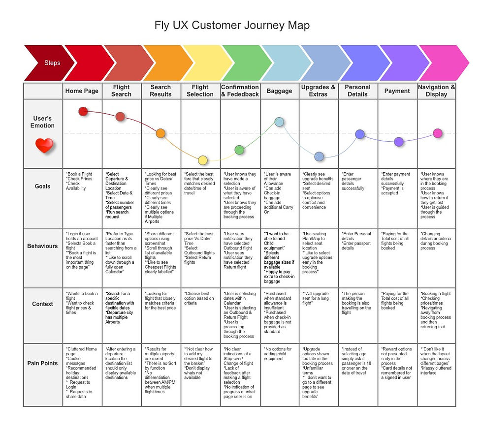
Customer Journey Map
Further analysis of the groups created from the Affinity Diagram allowed me to delve deeper into the key steps of the User Journey. For each step in that journey I examined what were the users goals and behaviours, in what context were they carrying out these steps, what were their pain points along the way and how did they feel throughout the journey. I created a Customer Journey Map as a more structured, simple & effective way to present the Customers point of view to the Product Owner and Business Stakeholders. The map provided an overview of key areas within the site that needed improvement in terms of User Experience.
Research Conclusions
The affinity diagram and user journey map led to the identification of clear primary pain points in the user airline booking journey:
-
Frustration when inputting data. This emerged as a significant annoyance for the majority of users
-
Confusion during the flight selection process as to how to proceed or how the flights were organised - this was particularly evident on multiple flight option or transatlantic flights involving stopovers
-
Pricing transparency - users wanted to know full price earlier in process and weren't always certain if price was per person or if extras were included. They also wanted to see the prices of flights close to their selected dates easily. A particular sore point was fees and charges etc being added at the checkout stage
-
Language and communication issues - the majority of users struggled with the language used by airlines and the stage they were at in the process. There was also a lack of feedback from the airline with regard to error messages or not being able to fly on a particular date. The copy often wasn't adequetely guiding them through the booking screens
SOLUTION DESIGN
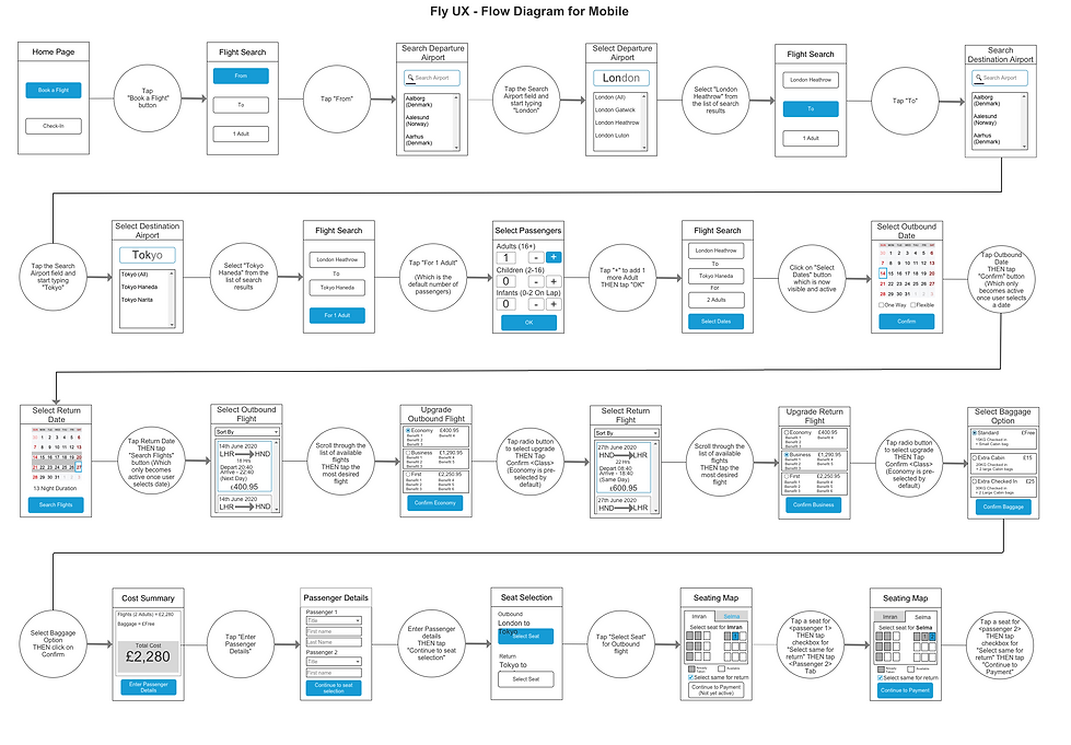
User Flow Diagram
Detailed flow diagrams were created to illustrate the primary user flow (and potential secondary paths) through both the desktop website and mobile app booking processes - from the moment they enter the website to the end point of the booking process when payment has been confirmed.
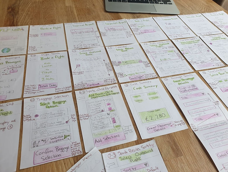
Sketches
After working out the user flow it was time to start visualising and designing interactions on the actual pages that were going to be redeveloped. A meeting was with held with the Product Owner to run through the flow as a typical user and to discuss the proposed wireframes.

Medium Fidelity Prototype
The sketches and flow diagram were used as a basis for creating an interactive Medium Fidelity Prototype that followed the primary user flow from searching for a flight through to selecting a seat. The prototype was developed in Axure and presented to the course moderators for analysis and feedback

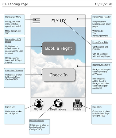
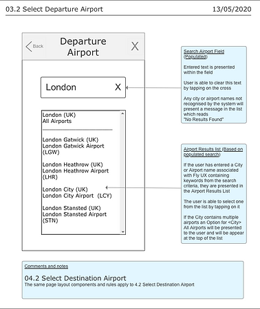
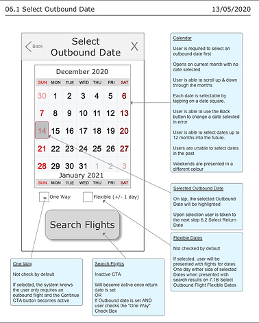
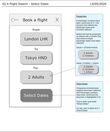
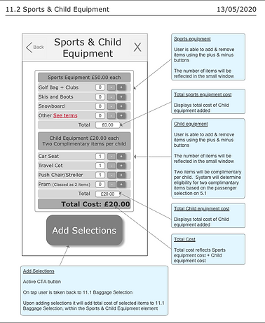
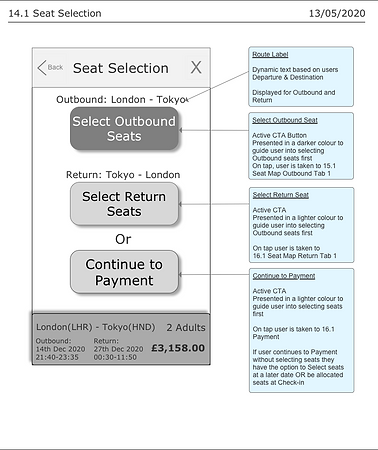
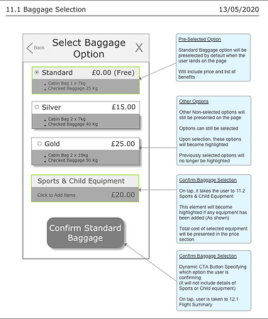
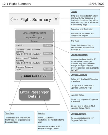
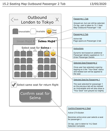
Wireframes
The final stage of the project was to create Wireframes with enough detail to be used by developers to build an App. The Wireframes included business rules with detailed interactive functionality


Validation and Acceptance
The Prototype and Wireframes were assessed by course moderators who confirmed successful completion of the coursework. Following an additional exam I was awarded a Diploma in UX Design
